Today we have another guest post written by one of our Archivists, Richard Wilson.
***
The Children’s Society was founded in 1881 and has a long history of innovating and adapting to improve the lives of children and young people. Just as the organisation has changed, so too has our branding. Here we’ll take a look at how The Children’s Society has presented itself over the last 130 years.
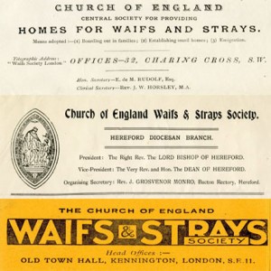
We started our work by establishing a single residential care home in Dulwich, South London for children living on the streets. The organisation was initially known as the Church of England Central Home for Waifs and Strays, but this soon changed to the Church of England Central Society for Providing Homes for Waifs and Strays as additional homes opened (the word ‘Central’ was changed to ‘Incorporated’ in 1893). Despite this rather long title, we were commonly known as the Waifs and Strays Society or often just the ‘Waifs and Strays’. The composite below shows branding from 1888, 1903 and the 1930s.
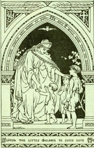
The middle part of the composite is taken from a letterhead and includes a lozenge shaped drawing on the left-hand side depicting Jesus with three young children. The drawing was frequently used by the Waifs and Strays Society in the early twentieth century and reflects the organisation’s Christian ethos. A complete form of the picture served as the cover image for our supporter magazine, Our Waifs and Strays, and is reproduced below. You will note that the drawing includes biblical quotes about the care of children, which are taken from Exodus 2:9 and Luke 18:16-17.
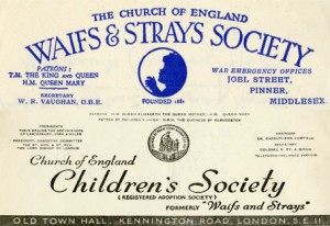
In 1946 the Waifs and Strays Society changed its name to the Church of England Children’s Society. This is still our official name today, although we started to use our abbreviated title, The Children’s Society, for most purposes in the 1980s.
The name ‘Waifs and Strays Society’ enjoyed widespread recognition and fondness amongst many supporters. It had, however, become archaic by the 1940s and no longer represented the variety of children and young people with whom we worked. There were also concerns that the name could stigmatise those in our care.
The composite below comprises letterheads from shortly before and after the name change.
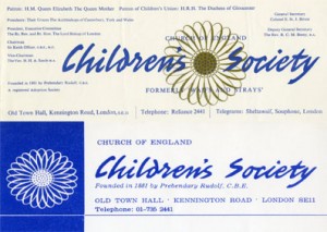
The Children’s Society used a sunflower as its logo between the mid-1950s and the early 1970s. The flower had already been used as a logo in connection with street collections and ‘Sunflower Days’ since before World War II and, in 1956, the Sunflower Guild was established for supporters who kept one of our collection boxes at home for regular giving. The composite below shows two letterheads bearing the sunflower logo. The top design was replaced with the lower one in around 1963.
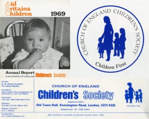
In the late 1960s we considered changing the name of the organisation, developing a new corporate slogan, or both. Suggested names included ‘Care’, ‘Child Savers’ and ‘Aid Britain’s Children’ (ABC). Whilst we decided not to change our name, we did use ‘Aid Britain’s Children’ as a slogan for a couple of years (top left image in the composite below).
We adopted a new logo in the early 1970s showing an adult holding hands with three young children (lower image in the composite). A similar logo was used in connection with our Centenary celebrations in 1981 together with the slogan ‘Children First’ (top right image in the composite).
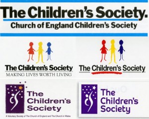
Shortly after our Centenary celebrations we adopted new, simpler branding without a logo (top image in the composite below). This remained in use until 1988 when a colourful new logo was introduced depicting three children with the strapline ‘Making Lives Worth Living’ (middle images in the composite). The new logo was part of a wider rebrand which sought to focus on the positive difference that the organisation made to the lives of children and young people rather than the negative circumstances that caused them to seek our support.
A further rebrand took place in 1998, when our previous logo depicting a person reaching for the stars was adopted. The original version of the logo had 13 stars (bottom left image in the composite), which could be interpreted as a representation of Jesus (the larger gold star) and the 12 Apostles, underlining our connection with the Church of England. The 13 stars also had historical symbolism, depicting 13 penny stamps – the first donation that our founder Edward Rudolf received over 130 years ago. Bottom right in the composite is the last version of the ‘reaching for the stars’ logo, which was introduced in 2010 and used until 2014 when our current branding was launched.

I am the proud owner of a Waifs and Stray collection box in New Zealand.
It has a picture of a little boy and girl lying on a door step
Above .. Please help
Underneath .. The Waifs and Strays.
On the top .. The Church of England Waifs and Strays Society
Patron TM The King and Queen
HM Queen Mary
The Penny A Week Box.
Please give a thank you offering
Each week for your happy home.
The side says there are 108 small homes in England and Wales and one in Canada.
Lots more information both sides and underneath. In great condition.
Very special piece of history.
Dear Jeanette,
Thank you for sharing. We have some collecting boxes here in the archive with the same picture on. What a lovely item to have in your home.
Janine
The old ‘logos’ have a dignity that will have been proscribed by the printer’s skill (an artisan printer of the time) who got the jobbing trade to turn out in leaden type a heading of some ready and available fount (font) and accompanying woodblock carving that, at the top of a letterhead indicated trust, care, honesty and ongoing-authority. The present online presented ‘logo’ has no such dignity being just another slick website-ish ordinary presentation much like any other website heading that one might click onto and click off to the next bland same-ish website whatever these ‘same-ish’ websites present or sell.
Dear Bobbie,
I’m glad you appreciate our older logos. These are really interesting as much of our early printing was carried out at St Aldhelm’s Home in Frome, Somerset. Here the boys were apprenticed to learn the art of printing. This home closed in the 1960s.
It’s interesting to see the changes in techniques and fashions in typefaces and logos as we move from the 1880s to today. Admittedly, our current logo is not as detailed as our logo was in 1903, but I think the new logo works for a modern audience that is bombarded by far more images than people were a century ago.
A lot of thought was put into the process of creating the new brand, including research with children and teenagers themselves, who really liked the idea of a clean logo that was more adult. In particular, the contrast in the black and white of the new brand will help us to expose the hard truths we find and to fight for change so that we can support disadvantaged children to have better lives.
Regards,
Janine